Shop on Lazada
Nalgene products
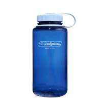
Nalgene 32oz Wide Mouth Water Bottle | Lifetime Warranty 1L Leakproof BPA FREE Tritan Perfect For Camping Sports Cycling
$27.90
Buy on Lazada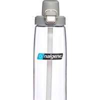
Nalgene 24oz On-The-Fly (OTF) Water Bottle
$37.90
Buy on Lazada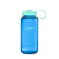
Nalgene 16oz Wide Mouth Water Bottle | Lifetime Warranty 500ml Leakproof BPA FREE Tritan Perfect For Sports Cycling
$24.90
Buy on Lazada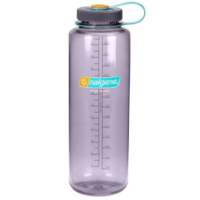
Nalgene 48oz Silo Water Bottle | Lifetime Warranty 1.5L Leakproof BPA FREE Tritan Perfect For Camping Sports Cycling
$24.80$35.90
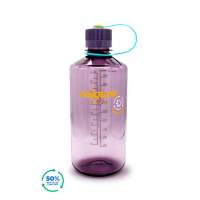
Nalgene 32oz Narrow Mouth Water Bottle
$27.90
Buy on Lazada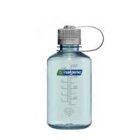
Nalgene 16oz Narrow Mouth Water Bottle
$24.90
Buy on Lazada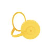
Nalgene 63mm Loop-Top Cap (Fits 32oz & 48oz Wide Mouth Water Bottle)
$4.90
Buy on Lazada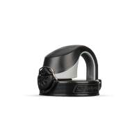
Nalgene 63mm On-The-Fly (OTF) Bottle Cap
$14.90
Buy on LazadaAbout Nalgene
Nalgene is an American brand of reusable drinkware and outdoor products, best known for its lightweight and highly durable plastic water bottles. The brand has a distinctive origin: rather than beginning as a consumer lifestyle company, it emerged from the laboratory equipment sector in Rochester, New York, before becoming closely associated with hiking, camping, backpacking, fitness, university culture and everyday hydration.1
Today, Nalgene positions itself around three core principles: durability, simplicity and reusable hydration. Its bottles are particularly recognisable for their translucent or brightly coloured plastic, large volume markings, screw-on caps and the iconic Wide Mouth design.2
Basic information
| Category | Information |
|---|---|
| Brand | Nalgene |
| Consumer name | Nalgene Outdoor |
| Origin | Rochester, New York, United States |
| Founded | 1949 |
| Founder | Chemist Emanuel Goldberg |
| Original business | Plastic laboratory equipment |
| Best known for | Reusable water bottles |
| Core market | Outdoor, travel, fitness, everyday hydration |
| Signature product | Nalgene 32 oz Wide Mouth bottle |
| Current material | Tritan Renew and other BPA/BPS-free materials, depending on product |
| Manufacturing | Nearly every Nalgene bottle/container is manufactured in the USA, according to the brand |
| Brand positioning | Durable, simple, reusable, practical |
| Notable slogan/idea | “Born from Science” |
| Parent-company context | Nalgene is associated with Thermo Fisher Scientific |
The brand traces its roots to 1949, when Emanuel Goldberg founded the Nalge Company in Rochester and developed plastic laboratory products.3
History
1940s: Born in the laboratory
Nalgene’s story begins in 1949, not with hiking or sport but with science. Chemist Emanuel Goldberg established the Nalge Company in Rochester, New York, initially specialising in laboratory products such as plastic pipette jars and other containers. The name Nalge remains closely tied to this original scientific and laboratory identity.4
This scientific heritage continues to inform Nalgene’s branding, with the company describing itself as “Born from Science.” Crucially, the original Nalgene bottle was essentially a piece of laboratory equipment that later found a second life outside the lab.
1960s: From laboratory to hiking trail
The pivotal transition occurred in the 1960s. Scientists at Nalgene who were also outdoor enthusiasts began taking their laboratory bottles on hiking, camping and backpacking trips. These bottles offered several qualities that made them unusually suitable for outdoor use:
- Lightweight construction
- Durability
- Leak resistance
- Relatively simple design
- Large capacity
- Resistance to breaking compared with glass
- Practicality for carrying water and other liquids
Other hikers noticed these containers, and what began as laboratory equipment gradually became an outdoor product. Nalgene describes this shift as the moment a new reusable water bottle category emerged.5 Importantly, the product was not invented specifically as an outdoor lifestyle accessory; its outdoor identity arose organically from its laboratory use.
The birth of Nalgene Outdoor
Growing popularity eventually led to the development of Nalgene Outdoor as a consumer-facing brand. The company’s scientific reputation became part of its appeal. Rather than presenting itself as a fashionable lifestyle label, Nalgene could effectively argue that a bottle designed to perform in a laboratory could withstand the rigours of backpacking.
This positioning proved powerful, and Nalgene became particularly popular among hikers, backpackers, campers, climbers, travellers, students, conservationists, athletes and outdoor enthusiasts. The bottle came to be regarded almost as a piece of outdoor equipment rather than merely a drinking vessel.
The 1980 “Miracle on Ice”
One of the most notable moments in Nalgene’s history occurred during the 1980 Winter Olympics. Nalgene became the official bottle associated with the U.S. men’s hockey team during the famous “Miracle on Ice” tournament. According to the brand’s historical account, the team’s bottle was adapted from existing scientific and outdoor designs and allowed players to drink without removing their hockey helmets.5
The event entered Nalgene’s brand mythology because the bottle was present during one of the most celebrated victories in U.S. Olympic sports history. The company has continued to reference this association as part of its heritage. In 2026, it released a limited-edition bottle inspired by the original USA Hockey design.6
From outdoor equipment to mainstream culture
In subsequent decades, Nalgene expanded beyond its original core outdoor audience. By the 1990s and 2000s, reusable bottles had become increasingly common in universities, offices, gyms, schools, music festivals, travel and daily commuting.
A significant development was Nalgene’s adoption of bright colours and graphics. According to the company, it pioneered the use of vivid colours and printed graphics on reusable bottles in the 1990s, helping transform the product from purely functional outdoor gear into an item capable of expressing personality and style.7 This marked an important branding shift: whereas a traditional outdoor bottle might signal “I am camping,” a colourful Nalgene could communicate “This is my bottle,” making the product relevant to a much broader audience.
The rise of the 32 oz Wide Mouth
Arguably the most recognisable Nalgene product is the 32-ounce Wide Mouth bottle. Its design is straightforward, featuring a large cylindrical body, wide screw opening, screw-on cap, translucent plastic, prominent measurement markings, the Nalgene logo and lightweight construction. The 32 oz (approximately 1-litre) format has become particularly associated with the brand.
The Wide Mouth opening is practical, making the bottle relatively easy to fill, clean, add ice to and use with accessories. Nalgene continues to offer this format as one of its flagship products.6 Compared with many modern hydration products, the design has changed surprisingly little, and this consistency forms part of the brand’s identity.
Materials: from polycarbonate to Tritan
Material technology is central to Nalgene’s history. Earlier bottles were famously made from polycarbonate, which helped establish their reputation for clarity and durability. The company later adopted Eastman’s Tritan copolyester, introducing a Tritan bottle in 2008. Tritan is a BPA-free copolyester designed to be durable, clear and impact resistant.10
This material change was significant as consumer concerns about BPA (bisphenol A) grew. Modern Nalgene bottles are marketed as BPA/BPS-free.
Tritan Renew and sustainability
Nalgene’s current sustainability narrative is increasingly linked to Tritan Renew, a newer material developed by Eastman. Tritan Renew uses Eastman’s molecular recycling technology, which breaks certain waste plastics down into their chemical building blocks to produce new plastic, rather than simply mechanically recycling material into another form.8
Eastman states that Tritan Renew can contain up to 50% certified recycled content through a mass-balance accounting system. Nalgene says its bottles are made with Tritan Renew as part of its effort to reduce reliance on single-use plastics.9 This represents a notable evolution for the brand: from laboratory plastic to outdoor reusable bottle, then to mainstream lifestyle product and now to recycled-content reusable bottle.
Design philosophy
Nalgene’s design philosophy is notably minimalist. The brand explicitly emphasises “No Frills”, arguing that simple products can be better products.10 Rather than competing primarily through sophisticated technology, Nalgene focuses on several key attributes:
Durability
Bottles are intended to survive years of repeated use and outdoor activity.
Simplicity
There are relatively few components compared with many modern insulated or filtration bottles.
Lightweight construction
Traditional Nalgene bottles are considerably lighter than many stainless-steel alternatives.
Large capacity
The 32 oz format is particularly associated with the brand.
Visibility
The translucent body allows users to see how much liquid remains.
Measurement markings
Graduated markings are a direct reminder of the brand’s laboratory heritage, making the bottle resemble scientific equipment more than conventional consumer drinkware.
Distinctive visual identity
Nalgene has developed an unusually recognisable visual identity. A typical bottle combines translucent plastic, bold colour, a black or coloured cap, measurement markings and a large logo. The appearance is functional rather than luxurious, differing markedly from brands that position hydration products primarily as fashion accessories. Nalgene’s visual language communicates that the product is equipment, which helps maintain its strong connection to outdoor and utilitarian culture.
Product range
Although water bottles dominate public perception, Nalgene’s product range is broader. Current categories include:
- Water bottles
- Kids’ bottles
- Accessories
- Containers
- Caps
- Sippers
- Insulated and neoprene sleeves
- Custom bottles
The company also organises products around use cases such as travel, outdoors, fitness and everyday use.12 Consequently, Nalgene is more accurately understood as a reusable hydration and outdoor container brand rather than solely a water bottle company.
Sustainability philosophy
Sustainability has become a major component of Nalgene’s modern identity. The basic environmental proposition is straightforward: using a reusable bottle reduces consumption of disposable bottles. Nalgene expresses this philosophy through the phrase “Refill Not Landfill”, arguing that durable reusable bottles can help reduce dependence on single-use plastic bottles.13
Key sustainability initiatives include:
Reusable products
Long-term reuse underpins the brand’s environmental argument.
Recycled-content materials
The company has moved towards Tritan Renew, which incorporates certified recycled content.9
U.S. manufacturing
Nalgene states that nearly every bottle and container is manufactured in the USA, presenting this partly as a way to avoid emissions associated with international shipping.
Water access
The company established the Nalgene Water Fund, supporting communities facing inadequate access to clean water.13
Nalgene Water Fund
The Nalgene Water Fund was established in 2019. According to Nalgene, the fund supports communities dealing with clean-water access issues and has provided more than $400,000 in financial and in-kind donations to communities including Flint, Michigan; the Navajo Nation; and Benton Harbor, Michigan.13 This initiative connects the product with a broader social proposition, framing access to water as a social issue rather than treating the bottle solely as a commercial product.
Brand identity
Summarised as a brand personality, Nalgene exhibits the following characteristics:
| Attribute | Nalgene |
|---|---|
| Personality | Practical |
| Tone | Friendly, outdoorsy, straightforward |
| Core value | Durability |
| Emotional territory | Adventure and independence |
| Functional territory | Hydration |
| Design language | Minimal, colourful, utilitarian |
| Cultural associations | Hiking, camping, college, fitness |
| Sustainability message | Reuse instead of single-use |
| Heritage | Scientific/laboratory |
| Price positioning | Accessible rather than luxury |
| Brand promise | Simple equipment that lasts |
The brand combines science, outdoors, sustainability and everyday culture in a way that distinguishes it from many competitors.
Comparison with modern competitors
Nalgene occupies a somewhat different position from brands such as Hydro Flask, Stanley and CamelBak.
| Brand | Strongest association |
|---|---|
| Nalgene | Lightweight reusable plastic + outdoor heritage |
| Hydro Flask | Insulated stainless-steel bottles + lifestyle |
| Stanley | Insulated drinkware + fashion/social culture |
| CamelBak | Hydration systems + cycling/outdoor sports |
| YETI | Premium outdoor durability |
| Klean Kanteen | Reusable stainless-steel products + sustainability |
Nalgene’s competitive advantage lies less in technological sophistication than in heritage, recognisable design, simplicity, durability and relatively accessible pricing.
Cultural significance
Nalgene’s importance extends beyond the physical product. It helped normalise the idea that carrying a reusable water container could be part of everyday life. The brand progressed through several cultural stages: from scientific equipment to hiking equipment, outdoor lifestyle accessory, student essential, fitness and travel accessory, mainstream reusable bottle and finally sustainability symbol. Nalgene itself describes its role in popularising reusable bottles and the “refill, not landfill” mentality.13
The importance of colour
Colour plays a surprisingly important role in Nalgene’s history. In the early years, function was paramount, but during the 1990s the brand began using more vivid colours and graphics, helping make reusable bottles more expressive and mainstream.7 This fostered something resembling a collectible culture, with consumers acquiring bottles in blue, purple, orange, green, pink, limited editions, institutional designs and custom versions. While the base product remained essentially unchanged, colour and graphics enabled personalisation. Nalgene continues this strategy today, including collections built around expressive colour palettes.9
Customisation
Customisation extends this philosophy. Nalgene offers consumers the ability to create personalised bottles, allowing an otherwise standardised product to carry individual or organisational branding. This is particularly useful for companies, schools, weddings, events, teams, organisations and gifts. The strategy suits Nalgene well because the underlying product is already recognisable; the bottle effectively serves as a blank canvas for graphics and branding.12
Manufacturing
Nalgene emphasises its American manufacturing heritage, stating that nearly every Nalgene bottle and container is manufactured in the USA. This reinforces several brand elements, including heritage, quality, manufacturing credibility, connection to its Rochester origins and outdoor authenticity. It also differentiates Nalgene from many consumer product brands that rely heavily on overseas manufacturing.
Ownership and corporate context
Nalgene’s history is intertwined with the scientific products industry. The original Nalge Company eventually became part of the broader laboratory products business associated with Thermo Fisher Scientific. This corporate heritage helps explain why the brand continues to emphasise its laboratory origins rather than presenting itself as originally invented as a lifestyle product. Nalgene’s authenticity derives partly from the fact that its outdoor identity genuinely evolved from an existing scientific product.
The “Nalgene” name
The name Nalgene originates from the original Nalge company. The brand name has since become so strongly associated with reusable plastic water bottles that “Nalgene” is sometimes used conversationally to describe the general type of bottle, even when the product is not made by Nalgene. This reflects strong brand recognition, with the trademark functioning as a category reference within outdoor culture.
75th anniversary
Nalgene celebrated its 75th anniversary in 2024, marking 75 years since the founding of the Nalge Company in 1949. The anniversary campaign highlighted the company’s journey from laboratory equipment to outdoor equipment, reusable bottle pioneer and modern sustainability brand. Special anniversary designs were released, including one referencing the historical mountain lion logo, and 20% of proceeds from the anniversary bottle were directed to the Nalgene Water Fund.6
Nalgene in 2026
As of 2026, Nalgene remains focused on its traditional core rather than radically reinventing the product. Its current strategy combines classic bottle silhouettes, new colours, limited editions, customisation, recycled-content materials, outdoor heritage, sustainability initiatives and social impact programmes. The brand continues to leverage historical associations; for example, its 2026 USA Hockey limited-edition bottle revisits the company’s connection to the 1980 Olympic team.6 The modern Nalgene strategy can therefore be described as retaining the classic product while modernising materials, colours, collaborations and cultural relevance.
Key differentiators
Nalgene’s strongest differentiator is arguably authenticity of origin. Many brands manufacture products specifically to appear rugged or scientific, whereas Nalgene actually originated in a scientific environment. Similarly, while many brands now market reusable bottles as sustainable alternatives, Nalgene has sold reusable containers for more than seven decades. Where modern bottles often compete through insulation, smart technology, filtration or elaborate mechanisms, Nalgene’s philosophy is essentially the opposite: make a simple, durable, reusable bottle that people can use for years. That simplicity is central to the brand’s identity.
Strengths
Extremely strong brand recognition
The distinctive bottle shape and translucent plastic make Nalgene immediately recognisable.
Authentic heritage
Its laboratory-to-outdoor history is difficult for competitors to replicate.
Durability
Durability remains one of the company’s central selling points.
Lightweight design
Compared with many stainless-steel alternatives, traditional Nalgene bottles are light.
Simple construction
Few complicated components mean less to break or maintain.
Affordable premium
Nalgene has historically positioned itself as quality outdoor equipment without becoming a luxury product.
Strong sustainability narrative
Reusable products, recycled-content materials and water access initiatives give the brand a broader environmental identity.
Customisation potential
The simple bottle shape works effectively as a branded promotional product.
Potential weaknesses and criticisms
Nalgene’s simplicity can also present limitations.
Lack of insulation
Traditional Nalgene bottles generally do not match the cold-retention performance of double-wall stainless-steel bottles.
Plastic perception
Even when BPA/BPS-free and containing recycled content, some consumers prefer metal or glass.
Less premium positioning
Against brands such as YETI, Stanley or Hydro Flask, Nalgene can appear relatively utilitarian.
Sustainability complexity
Reusable plastic is not automatically free of environmental impact. Production, transportation, end-of-life recycling and material sourcing all matter, meaning Nalgene’s sustainability argument depends heavily on long-term reuse.
Minimalist design
The same simplicity that makes the product iconic may feel basic to consumers seeking smart features, integrated filtration, insulation or sophisticated lids.
Brand archetype
From a branding perspective, Nalgene can be characterised as a combination of The Explorer, The Everyman and The Scientist. Hiking, camping, travel and adventure are fundamental to the brand (Explorer); the bottle is designed for ordinary daily use rather than exclusivity (Everyman); and laboratory origins provide credibility that distinguishes it from purely lifestyle-driven brands (Scientist). This combination makes the product feel both technical and approachable.
Evolution timeline
- 1949 – Emanuel Goldberg establishes the Nalge Company in Rochester, New York.11
- 1950s – Development of plastic laboratory containers and equipment.
- 1960s – Scientists begin taking laboratory bottles hiking and camping.12
- 1970s – Nalgene develops a stronger outdoor identity.
- 1980 – Nalgene bottle becomes associated with the U.S. Olympic hockey team’s “Miracle on Ice.”13
- 1990s – Bright colours and graphics help turn reusable bottles into lifestyle products.14
- 2000s – Nalgene becomes widespread in colleges, gyms, offices and mainstream outdoor culture.15
- 2008 – Nalgene adopts Eastman Tritan for its bottles.14
- 2019 – Nalgene Water Fund established.13
- 2020s – Increased focus on recycled-content materials and sustainability.
- 2024 – 75th anniversary.6
- 2026 – Continued expansion of colours, collections, sustainability initiatives and heritage products, including the return of the USA Hockey design.6
References
- Our Story | Nalgene
- Affiliate Program | Nalgene
- Our Promise | Nalgene
- Nalgene – The original water bottle. BPA Free.
- Built for the Miracle. Back for the Olympics. | Nalgene
- Nalgene Outdoor Celebrates 75 Years with Two Exclusive Designs | Nalgene
- Nalgene Outdoor Unveils Thrill & Motion: A High-Energy Color Collection | Nalgene
- Brand Ambassadors | Nalgene
- Nalgene Drops New Collection of Eye-Popping, Color Block Water Bottles | Nalgene %
- Let’s Find Out What We’re Made of: Getting to Know Tritan | Nalgene
- Nalgene for Everyone
- Collections | Nalgene
- Mission-driven Archives | Nalgene
- Tritan Archives | Nalgene
- Nalgene – The original water bottle. BPA Free.